Visualizing Correlates of War Data With Leaflet.js
William Lyon
February 14, 2014
7 min read
The Correlates of War project maintains several data sets that document conflicts throughout history. This includes data on armed conflicts such as inter-state disputes as well as ancillary data that might be correlated with disputes, such as trade, alliances and measures of countries' resources. This data makes for interesting geographic visualizations. This post highlights how Leaftlet.js can be used to create geographic data visualizations using this data.
Using Crosslet.js to compare battle related fatalities with national capability#
Can we see any relationship between the fatalities a country suffers during disputes and it's national capabilitiy?
The Data
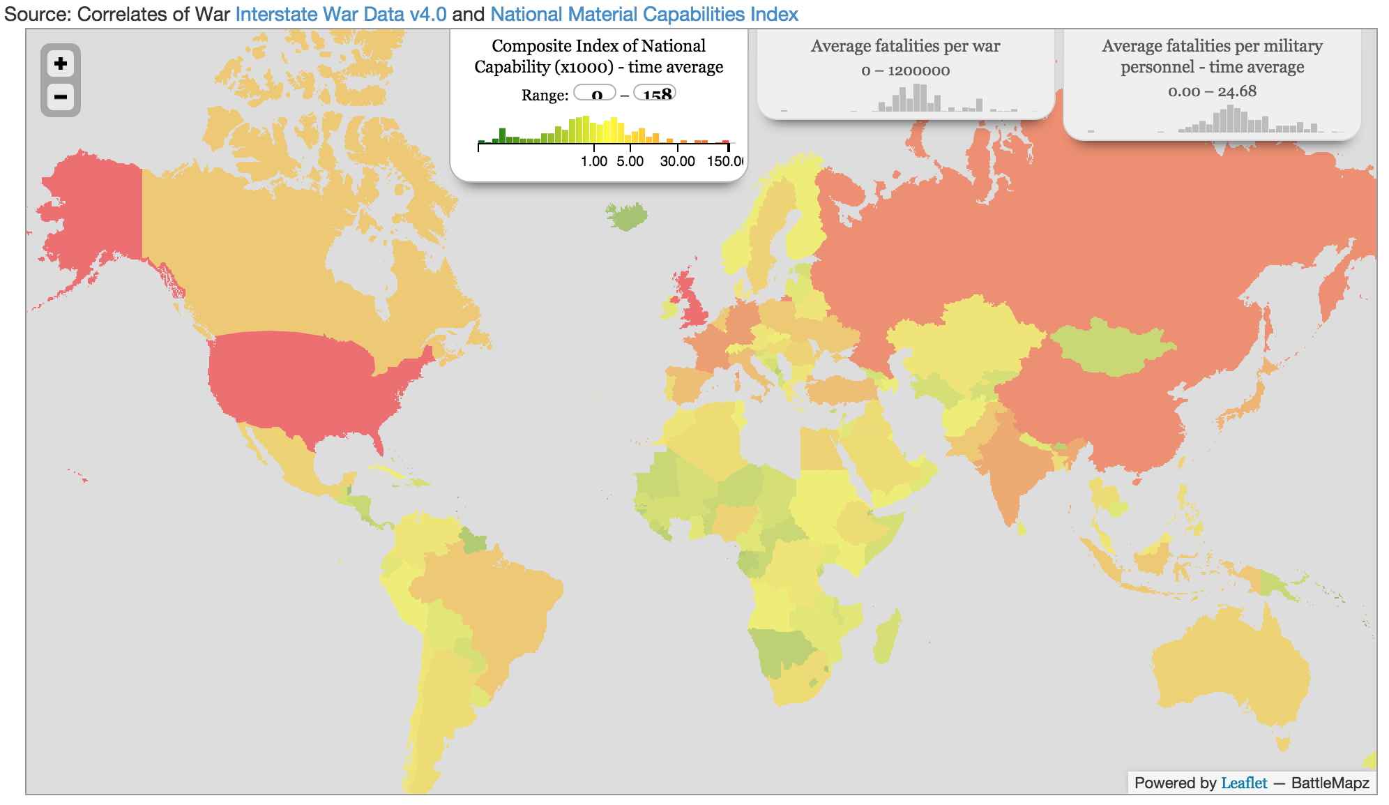
This first visual uses two datasets from Correlates of War:
The National Material Capabilites data set contains annual values for total population, urban population, iron and steel production, energy consumption, military personnel, and military expenditure of all state members, currently from 1816-2007. The widely-used Composite Index of National Capability (CINC) index is based on these six variables and included in the data set.
This data set records all instances of when one state threatened, displayed, or used force against another.
Specifically, three values are computed for each country listed in the dataset:
- CINC time average - the mean Composite Index of National Capability value over time
- Average fatality - the mean number of battle-related fatalities per militarized interstate dispute
- Average fatality per military personnel - average fatality relative to the size of that country's military, measured by the number of military personnel for the observation year.
Crosslet.js
An awesome javascript library called Crosslet that uses D3, Leaflet.js and Crossfilter.js to create great data centric geographical visualizations is leveraged here. From the developer's website:
Crosslet is a free small (22k without dependencies) JavaScript widget for interactive visualisation and analysis of geostatistical datasets. You can also use it for visualizing and comparing multivariate datasets.
Using Crosslet is very straight forward. First build the config object that specifys our Leaflet API key and the geoJSON file we wish to use to define the borders of the countries we wish to highlight:
var config = {
  map: {
    leaflet: {
      key: "YOUR_LEAFTLET_KEY_HERE",
      styleId: 64657,
      attribution: "BattleMapz"
    },
    view: {
      center: [35.0, 0.1],
      zoom: 2
    },
    geo: {
      url: "data/world.topo.json",
      name_field: "NAME",
      id_field: "NAME",
      topo_object: "world"
    }
  }
Next, we specify which data we want to load.
dimensions: {
    cinc: {
      title: "Composite Index of National Capability (x1000) - time average",
      data: {
        //colorscale: d3.scale.linear().domain([-1500, 5, 200]).range([ "red", "yellow","green"]).interpolate(d3.cie.interpolateLab),
        dataSet: "nmc_data.tsv",
        field: "CINC",
	method: d3.tsv,
	ticks: [0,1,5,30,150],
	exponent: 0.1

      },
      format: {
        input: function() {return Math.round},

     }

    },
Finally, instantiate a new Crosslet map object using the config object we just created, passing the DOM element where it should be rendered on the page:
new crosslet.MapView($("#map"),config);
In the Crosslet widget above, you can see that we have three dimensions of data displayed in a choropleth map. We can also see the distribution of each variable as displayed in a histogram/color map for each variable. One of the powerful features of Crosslet is that we can select a range over which to slice the observations. This piece is powered by Crossfilter.js. This slicing of the data allows for some interesting visual analysis. By selecting the upper range of the CINC index data do we see a change in the distribution of average fatalities?
Scatter plot
This map based visualization makes for interesting exploratory data analysis, but we can use more conventional data visualization techniques to test our hypothesis as well. For example, this scatter plot shows a time-average of the CINC score vs. average battle related fatalities relative to the size of a country's military on a log-log scale. A regression shows that there is a weak negative relationship between average fatalities per battle and a country's CINC score.
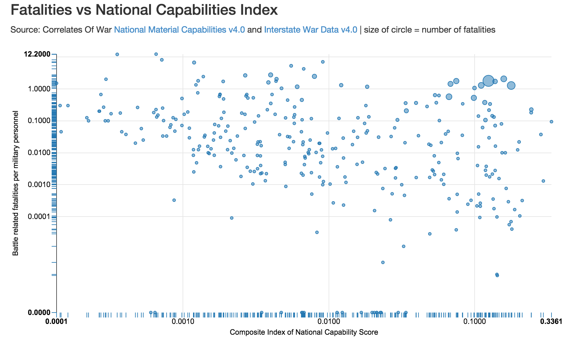
This visual was created with the NVD3 library, which is built on top of D3.js.
Visualizing battle related fatalities geographically#
Next, visualizing inter-state dispute fatalities throughout history using a heatmap. Can we identify "hot" areas where more fatalities occured?
The Data
This visual makes use of Militarized Interstate Disputes v4.0 and the Militarized Interstate Dispute Location datasets. This data is initially in three csv files. I used a Python script to read in the data and do some initial descriptive data analysis, exporting the data into JSON format:
...
	{
        "dispNum": 3,
        "stDay": 2,
        "stMon": 5,
        "stYear": 1913,
        "endDay": 25,
        "endMon": 10,
        "endYear": 1913,
        "outcome": 4,
        "settle": 3,
        "fatality": 0,
        "fatalPre": 0,
        "maxDur": 177,
        "minDur": 177,
        "hiAct": 8,
        "hostLev": 3,
        "recip": 0,
        "numA": 1,
        "numB": 1,
        "link1": "0",
        "link2": "0",
        "link3": "0",
        "ongo2001": 0,
        "version": 3.1
    }
    ...
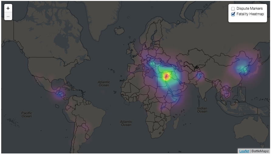
Fatality Heatmap With Heatcanvas
This visual uses the heatcanvas library to generate a heatmap overlay to highlight battle related fatality levels throughout the world. The value of each pixel displayed on the map is defined by its distance to points that holds data (in this case fatality level for a dispute).
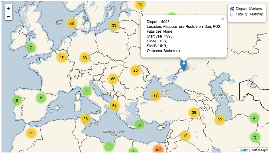
Markercluster
Marker annotation functionality is provided by Leaflet, however the easy to use Leaftlet.markerCluster plug-in handles overlapping annotations by grouping them and tracing the area of the map covered by a given cluster of annotations.
Client JS
Data munging is a bit more involved for this visual. To make this process a bit more syntactically simpler we can use the sift.js library. This javascript library provides MongoDB like syntax for filtering javascript arrays. It allows us to do things like this:
var sifted = sift({ $in:['foo','bar'] }, ['bob','loblaw','foo']); // sifted = ['foo']
This will make things a bit easier for us as we:
- Join the data sets
- Create the Leaflet.js Tile Layer and init the Marker Layer and HeatCanvas Tile Layer objects
- Build the marker text, and finally
- Add the Layers to the map.
var testData={data:[]};
for (var i=1; i<MIDA.length; i++) {
	var midlocCurrent = sift({'dispnum': MIDA[i].dispNum}, battleData)[0];
  var lat = midlocCurrent.latitude;
  var lon = midlocCurrent.longitude;
  var outcome = MIDA[i].outcome;
  var value = MIDA[i].fatality;
  var sideA = sift({'dispNum': midlocCurrent.dispnum, 'sideA': true}, MIDB);
  var sideB = sift({'dispNum': midlocCurrent.dispnum, 'sideA': false}, MIDB);
  if (value != -9){
    testData.data.push({'dispNum': midlocCurrent.dispnum, 'lat': lat, 'lon': lon, 'value': value,'location': midlocCurrent.mid21location,'outcome': outcome,'sideA': sideA,'sideB': sideB,'year': midlocCurrent.year});
    //console.log(lat, lon, value);
  }
}
var baseLayer = L.tileLayer('http://{s}.xxx.{z}/{x}/{y}.png', { attribution: 'BattleMapz', minZoom: 2, maxZoom: 18});
var markerLayers = new L.MarkerClusterGroup();
var heatmap = new L.TileLayer.HeatCanvas({},{'step':0.3, 'degree': HeatCanvas.LINEAR, 'opacity': 0.7});
view raw
for (var i=0; i<testData.data.length; i++){
var marker = new L.Marker(new L.LatLng(testData.data[i].lat, testData.data[i].lon));
var sideANames = '';
var sideBNames = '';
for (var a=0; a<testData.data[i].sideA.length; a++){
sideANames += testData.data[i].sideA[a].stAbb + ', ';
}
for (var b=0; b<testData.data[i].sideB.length; b++){
sideBNames += testData.data[i].sideB[b].stAbb + ', ';
}
// TODO: map codes to fulltext (countries, outcomes, fatalities)
marker.bindPopup('Dispute: ' + testData.data[i].dispNum + '<br>Location: ' + testData.data[i].location +'<br>Fatalities: '+ fatalityDict[testData.data[i].value]+'<br>Start year: ' + testData.data[i].year.toString() + '<br>SideA: ' + sideANames + '<br>SideB: ' + sideBNames + '<br>Outcome: ' + outcomeDict[testData.data[i].outcome]);
markerLayers.addLayer(marker);
heatmap.pushData(testData.data[i].lat, testData.data[i].lon, testData.data[i].value);
}
var overlayMaps = {'Dispute Markers': markerLayers, 'Fatality Heatmap': heatmap};
var controls = L.control.layers(null, overlayMaps, {collapsed: false, autoZIndex: true});
var map = new L.Map('map', {center: new L.LatLng(51.505, -0.09), zoom: 2, layers: [baseLayer]});
controls.addTo(map);
Here's how it looks (images link to the actual interactive widget - will take a few seconds to load):
Militarized inter-state disputes marker cluster
Fatality heatmap of inter-state disputes
Problems with this visual
- The maximum fatality level is 999+, swamping disputes that resulted in thousands, hundreds of thousands, and even millions of fatalities.
- Location is set where the dispute began, not where individual battles occured
- Only 1 datapoint per dispute
- Loading performance is poor, mostly due to the data munging being done in the client. The data should be prepared in the format intended to be used ahead of time.
Thanks to the maintainers of the Correlates of War project. Building these visuals was a sobering experience for me. The full code for this project is available on github.
Stay Updated
Get notified about new posts and videos